
Student Project - 2018
Bringing Dynamic Filtering to Modern Banking
Bank of America Mobile App Search Expansion
Introduction
Your phone is your new bank.
Modern banking customers use their banking apps at least once a day; the range of services that customers are using their apps for is replacing the old functions of brick and mortar banks. I have found that younger users are turning to their banking apps and supplemental apps as their go-to service for managing their finances–and also as a running public record of their financial interactions.


Initial User Interviews
Users keep track of financial records predominantly with their apps.
When asking my interviewees about how they use their banking apps, I found out that they use them in a variety of ways – many of these uses mirror the ways they have used traditional banks in the past (making deposits, checking balances, issuing money transfers, etc.).
However, I found that younger users use their banking apps to keep track of their spending. Users would do this by keeping a log of their purchases and financial transactions. They tended to use their banking app as a running "feed" of their finances. But for transactions that did not occur in the last week or so, many users had trouble finding specific entries. This seemed to occur especially with Bank of America’s web and mobile services, which does not offer search services beyond a simple text search.
The problem I suspect is that Bank of America need a more efficient way to navigate their transactions.
Survey Summaries
I used my initial interviews to define my problem by picking users from a broad age range and economic background. My extended interviews ranged from 30-something executives to 60-something retirees. After doing this, I used supplemental surveys, which revealed that the majority of users were frequently using their apps to keep track of their financial records. Though when they used the offered filtering options, the users still had trouble pinpointing specific transactions.


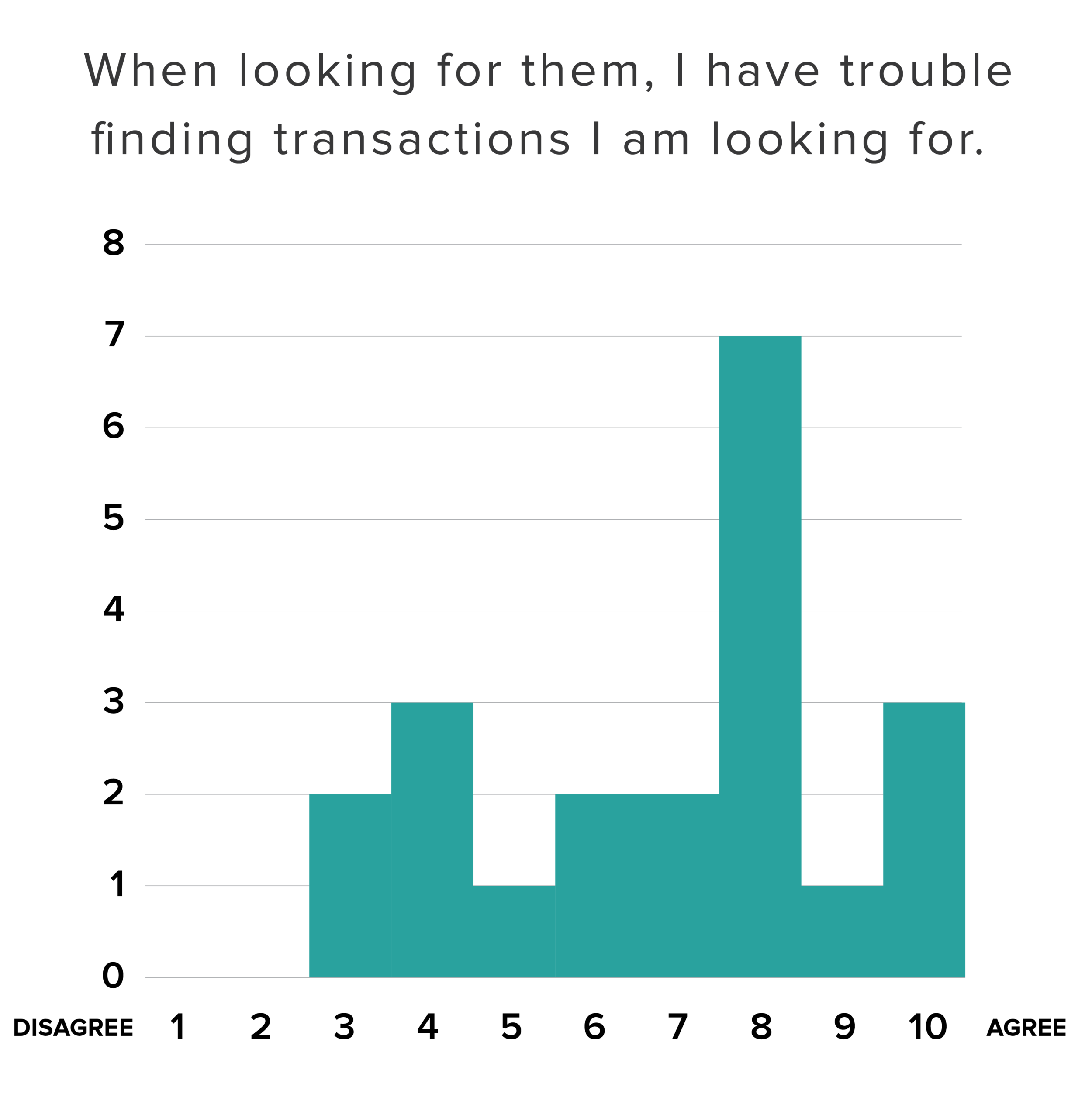
From this data, I found that users would go to their transaction feed to keep track of their finaces. I also found that, when offered, users prefered to use their filtering options to find specific transactions. And finally, with these aids, the majority of users still often had trouble finding transactions easily.
Research Scope


Competitor research
Competitors offer options when navigating your finances.
Looking at the current offerings from Bank of America, I found that they offered a simple text-based search that would only search for the text in the transaction title. I found some common options; namely, ordering by amount or date and offering categorization as filter options.

Sketches & Ideation
From pen to paper…

The Solution
…to pixels & prototypes.


Simplified user flows
Getting you where you need to go at every stage of your experience.
The existing search appears after navigating 4 steps deep into the accounts page navigation. I want to provide the opportunity to search more frequently and prominently in the app. Therefore, I've placed it on the landing page, account page, and have it present at every step of the way.
Existing Flow

Revised Flow
Viewing the existing flow, I found that users had to dig much deeper into their apps before they were offered filtering options. I did not want to take that function away from users, but rather I offered it sooner, and with more options so the user would not have to search for their search options.


Filtering Options
Taking the standard and making it better.
I want to improve on the existing text search built into the previous application by expanding and changing the order based on amounts and dates pulled from competitive analysis. In addition, I want to provide date and amount ranges for a more flexible filtering system. Additionally, I want to provide a category tagging system that allows users to make their filtering as dynamic as possible, i.e. categories such as debit card payments, food & drink, over $120.

User responses
After going through three rounds of testing with a pool of 20+ users, I got great feedback to help refine what users wanted and how they should navigate to their needs. The final prototype got a majority of positive feedback from users who found what they needed in a simple and intuitive way.
“The task was very intuitive and successful.”
“Success. The changes from the first iteration are noticeable and clear!”
“I found the process simple and clear.”
Next Steps
Additional opportunities.
While exploring the existing Bank of America app, I have found many opportunities to expand on the build with features that include…
Simplified Login

Streamlined Payment

Prominent Budgeting
Reoccurring Payments

Budgeting Reports

User Notes

Thank you for your time.