
Redesign Concept - 2016
A Reimagining that keeps key features above the fold
BBC News: Application Reskin
Introduction
One reskin with three new updates.
Taking an in-depth look at the existing BBC mobile app, I discovered a couple reoccuring problems in the structure of their app.
There were three reoccurring problems I found in the current application design. They were that the search function was buried in the UI, there was no easy way to navigate between sections, and you could only share stories once you were in the story proper.
I fixed all these issues while also upping the animation styling for the app to provide a more delightful user experience.

Sketches
Mapping out BBC's new face of news.
Before working to improve the design of the app, I put pen to paper to frame what was working and what wasn't. Doing this process was necessary not only to place aspects of the app on the page, but to take stock of the multiple elements that needed to be folded into the users experience.
Existing

Redesign

The Home Screen
Get to YOUR news in a tap.
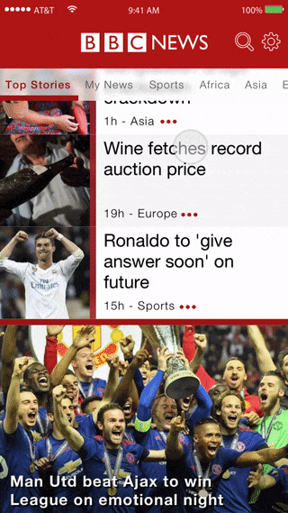
Using the existing BBC app, it was difficult to quickly reach sections of the app. For sections such as technology, entertainment, or even top stories that were not at the top of the cue, users were forced to scroll over and over to find the sections they wanted to read.
I addressed this by providing all the news sections as a top scroll for the user. With a tap of a section, the user could be brought immediately to the news they want to read. With a quick tap, the user does not have to go through sections they have no interest in. They are brought to the content they want in a heartbeat.
Navigation as your road map.
I wanted the dynamic navigation to now only allow users to travel between news sections in a snap. I wanted it to be a constant marker for where the user is.
The current application has section heads that mark the entry into a new portion of the app. I replicated this with large header stories to introduce the user to the new content. At the same time, the top nav will change its marker for the section.
In the original layout, there was no constant marker to let you know what section you were in. The current design allows you to look at the top of the app at any time to be reminded where you are. No more looking back down at your phone from a distraction, losing your place.
Existing

Redesign

Search
Making finding what you need, easy to find.
In the current build of the app, search is nested in the settings panel. Given that searching for old stories is a core function of any news site, this felt like a bad place for it.
With this in mind, I put a search button in the top nav, separate from the settings panel. But I wanted to provide two avenues to search, given that it was such an important function for users. With this in mind, I also hid a search panel above the top border of the app.
I kept the placement consistent between the button and the scroll to teach the user of its location but gave users two opportunities to use it. Above the top of the nav is a common placement for search so I followed existing standards but also provided the button as an additional learning tool.
The new flow lets users search an a quicker and more intuitive manner then the existing build, in a way that feels natural to find what you need.
Existing

Redesign

Social
Share the good news.
This was a minor fix, but in the current design, to use iOS sharing features, you would use a three-level user flow.
I wasn’t going to remove these panels from stories, but I wanted to add a share feature to the news feed. Not only would this cut the steps down to two, but it would provide multiple avenues to share. If you had seen a story that you already read but exited to the home screen, I provided an option for users to still share if the impulse hits them after they left the story.
With this tweak, I provided an option to help users share the coverage they want, but also provide BBC exposure across socials, email, airdrop and more.
Animation
Breaking news in a polished presentation.
In addition to providing the improvements above, I gave users animations to elevate their news experience. Meeting users at their needs is key but giving them an elegant experience is what can separate your experience from other apps. With a few subtle improvements, I worked to make premiere feel essential in its function and premiere in its presentation.
Loading Screen

Settings Page

Thank you for your time.