
Candy Digital - 2021
Building a Start Up's Design System from the Ground Up
Candy Digital's Figma Design System

Introduction
Building the Backbone of Candy’s Platform
Candy launched its digital collector’s marketplace in October 2021. The company works in an entirely digital landscape, providing collectors items to its users where they can view, share, buy, and sell limited collectable assets. Leading up to the platform’s launch, Candy built out a flexible design system that existed both in Figma and in the development environment, allowing for cohesive design work among the Candy design and engineering staff.


The Problem
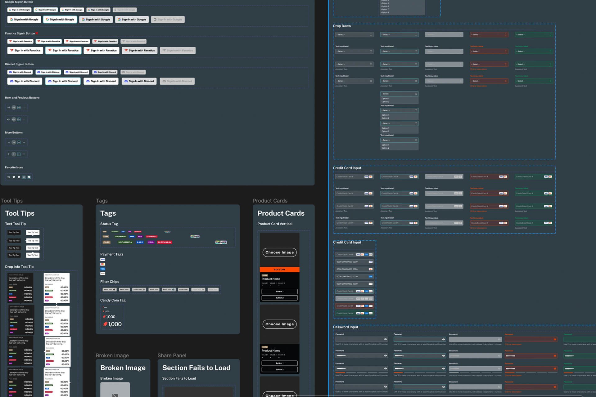
Giving structure to Candy’s design platform
When ramping up to Candy’s original launch, the existing design system featured only atomic level components (buttons, tags, banners, etc.). The components were also disorganized and many were built around very specific use cases. For example, there was a whole set of banners built with copy and images for very specific run dates.
My Role
Design System Designer
I was brought in and given 3 weeks to organize, and expand the existing design system. While doing so, I was given a front-end developer whose role was to re-create each component, typographic style, color set, and vector asset in our font-end engineering library. This was to make sure that our site looked and behaved exactly as designed in every instance.
Design Tokens
Taking Atomic Design Sub Atomic
In building the design system, I started at the “Design Token” level. I built out a series of color swatches and type classes that were plugged into every component. This allowed for consistent design throughout the system but also easy updates or changes at the most granular level. Changes to the design tokens would ripple up throughout the design system to affect every component.
152 Color Swatches
50 Type Classes
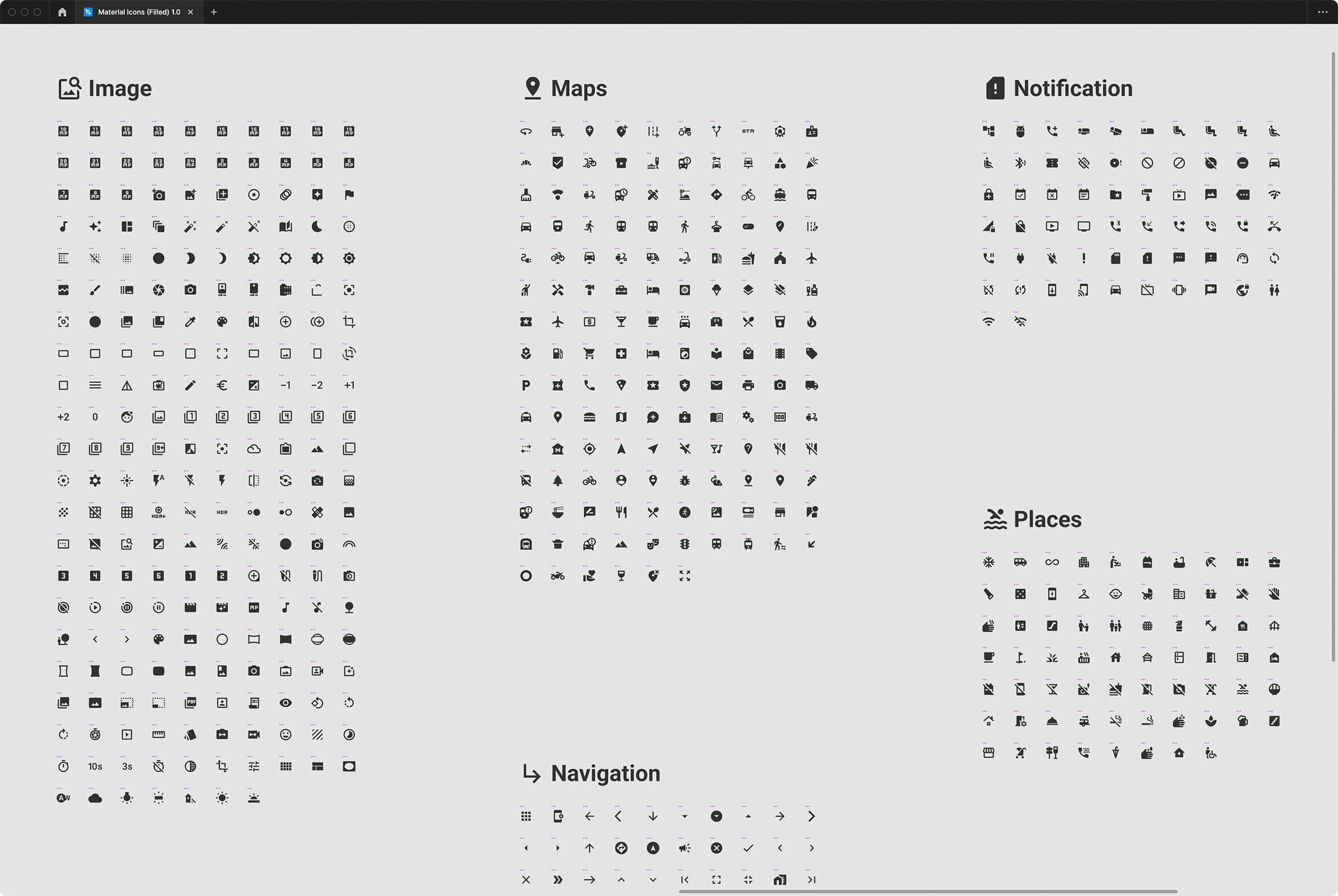
Icons
Plugging into Google’s pre-built library
When incorporating our icon system we utilized Google’s material icon library. The open-source library gave designers a myriad of icons to use in any use-case they would need. In the Figma library, rather than incorporate the icons directly into the components or variants, we built each icon library separate so that designers could toggle them on and off when necessary.
Spacing System & Grids
Giving the platform a skeleton
We used the out of the box tailwind spacing system to give designers greater flexibility at smaller ratios. This allowed designers the freedom to fine-tune small adjustments in their layout. We also built in a standard 12 column skeleton grid for desktop, 8 column for tablet, and 2 column for mobile.
Tailwind Spacing Scale

Baseline Grids

Nested Components
The component is inside the component!
A major concern when making the design system was to make sure that it would be not be overwhelming for our designers. A big turning point in this process was building a nested structure to each component similar to how design tokens were nested. In making each component and its variants exist inside of larger more complex components, I was able to make design components that were usable and contain a manageable number of variants.
Responsive Components
A component as fluid as its layout
Each component, all the way up to the molecular level, was built to adapt to any layout it was put into. This means that any component was built to adapt to any fluid layout it was placed into. Also, components were built to adapt around content put into them.
Building with a developer
Bringing our design system to life in code
While building out the Candy design system, we had daily standups with a front-end developer who built our system one for one in the engineering development library. This meant that our designs would be consistent throughout the platform and just as easy to adjust and update as they are in Figma.

What I learned
Find the fine line between simple and usable
When building the design system I learned a couple valuable lessons to make it usable to our end user (both developers and designers). Some insights include:
- Don’t overwhelm the designers with options.
- When you make things modular, you make it more manageable for the user
- Build atomically. If you organize everything at a granular level and build up, changes and updates can ripple throughout the system.
- Make sure components respond and behave in the Design Tool, the same way they would in the development environment.
- Keep it simple. Don’t make one-off type classes or colors unless absolutely necessary. The system should always hue toward simple.
- • Design effort does not equal development effort. Some design styles that are easy to apply are very difficult for developers to incorporate. Inversely some things that are hard in the design tool are easy for developers.
Thank you for your time.