• Work
  • Resume
  • About
Christopher Woodside
  • Work
  • Resume
  • About
WebAI - 2024
Taking an Alpha Level App to Beta with the Voice of the User
AI Model Creation Tool Audit
Introduction
Testing our Users to Elevate our App

Shortly after joining WebAI, I proposed a research effort to audit the current state of the app. WebAI Navigator was an application built to allow low/no code users to build their own custom Artificial Intelligence models. The idea was to take users through the current state of the app, give them a series of tasks based around the core flow of the application. We would then collect feedback and see where they tripped up while trying to build their first model.


Team & Roles
Elevating an App is a Team Sport
Christopher Woodside
Staff Product Designer (Me)
John Lahr
Product Growth CSPO
Seb Charroud
VP of Product
 
 
Current State
A No-Code AI Builder Beta That Transforms Ideas into Models

When I joined WebAI, their main product, Navigator, was still in alpha stage but preparing for a limited beta release. The company's AI Model builder, Navigator, was designed to allow people with no machine learning background to create their own custom AI models. Development, to this point, had been entirely internal and the application had been developed entirely in-house without any user testing or market feedback.

 
The Problem
Helping Our Users Make Their First Artificial Intelligence Model

After being onboarded with the team at WebAI, I spoke with our head of product who highlighted that while our app was getting a fair number of downloads and users who were testing it, there was a low rate of users who were able to successfully build their first Artificial Intelligence Model. Our team was tasked to figure out why users weren’t able to get a project setup or get an AI model running.

 
The Script
Getting to Know our Users and Asking the Right Questions

Before testing our users, I began preparations by drafting a testing script. The script opened with core demographic questions (location, age, professional title, commonly used tools, AI familiarity, interest in WebAI) and from there I prompted users through the login screen all the way to getting an model up and running.

To evaluate the app's intuitive design, I intentionally kept the usability prompts open-ended. The script was also structured to allow organic exploration, enabling participants to investigate areas they found particularly interesting, confusing, or delightful. Once I received approval for the testing script, I coordinated with our Growth Product Manager to gather participants for our sessions.

 
Who We Spoke With
Picking the Right Users

During the script approval process, I collaborated with our Growth Product Manager to define our ideal set of participants. Since engineers were the company's primary target user base, we prioritized participants with an engineering background.

However, I advocated for including one to two non-technical participants to gain valuable perspective on the app from non-technical users. This strategy led us to recruit a group of six participants for our testing sessions.

Participants
Jared Hills
Mechatronics Product Engineer • Grand Rapids, MI
Alex Mead
Backend Engineer • Grand Rapids, MI
Ignas Gaucy
AI Consultant • Italy
Ken Bodnar
Solutions Architect • Cayman Islands
Alex Brothman
IT Director • Los Angeles, CA
Dimitri Angelov
ML Data Scientist • Durham, NC
 
The Sessions
Structure and Freedom to Guide our Sessions

Over the course of one week, I conducted 6 interview sessions. We used the latest alpha build of the app to provide participants with the most authentic experience possible. This also had the added benefit of dramatically expediting our timeline and eliminating the need for any prototype work.

We led the users through the approved script recording each session and allowing the user to deviate at appropriate points. Session lengths varied from one to two hours, depending on the depth of participant feedback and their time availability.

 
Synthesis
Six Sessions, Forty-Nine Insights

Following the user interviews, each session was meticulously documented within our research platform. Key takeaways were highlighted and tagged, facilitating efficient analysis. This process yielded 456 distinct highlights, which were then categorized into 49 key insights. Using these insights as a basis, I wrote out 30 actionable design recommendations for the team to consider.

The insights and their corresponding recommendations were then presented to the co-founders, product team, and key engineering members for discussion and feedback before we discussed next steps.

 
Design Recommendations

Below is a selection pulled from the 30 design recommendations we documented:

Application Focus

Our Recommendation

When asked what users thought the application was and its purpose, they identified it as a low-to-no-code tool for building AI models.

The canvas layout resonated with users, and they expressed significant interest in a tool that helps non-developers build complex AI models.

I recommended prioritizing the AI model building functionality as the primary focus for the tool, while deprioritizing other development efforts such as model deployment and local-first hardware.

Templates Based on Use Case

Our Recommendation

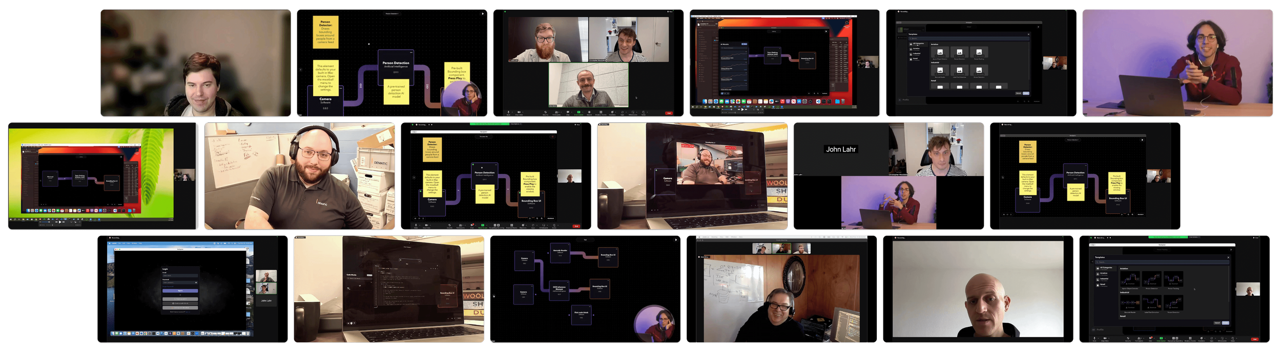
Users reacted negatively when presented with templates organized by industry (manufacturing, aviation, medical, etc.).

Instead, they expressed stronger interest in templates organized by use case (LLMs, object detection, dataset generation, etc.).

My recommendation was to pivot to this use "case-based organization" and I proposed a follow-up card-sorting exercise to ensure our templates properly align with user needs.

Common Login Options

Our Recommendation

Multiple users expressed strong negative reactions to Metamask and other "Web 3.0" login options on the login screen.

Based on this feedback, I recommended removing these options as they appeared to negatively impact users' first impressions of the application.

Better Run Feedback

Our Recommendation

Every user who built a model with the application was unsure what was happening when they clicked the “run” button. Many users weren’t sure if anything was happening at all.

Therefore, I recommended building overt notices for the user that their project was being processed rather than the subtle signifiers that were in the current built.

Interactive Canvas Elements

Our Recommendation

Users struggled to find and navigate the settings panel for elements on the canvas. They frequently double-clicked on elements expecting this action to reveal more details.

The design recommendation was abandoning the current 'under the hood' settings approach in favor of making elements open with a double-click to display their most important settings.

Additionally, elements should provide more visible details and results when possible.

Export AI Models

Our Recommendation

Users expressed significant frustration regarding how to export AI models from the application in formats compatible with their existing setups.

I recommended enabling users to export their models in formats compatible with common AI deployment platforms (AWS, Azure, custom on-premises setups), in addition to supporting the company's own proprietary system.

Onboarding Through Templates

Our Recommendation

Users expressed strong dis-interest in walk-through tutorials or on-screen prompts when getting familiar with a tool.

They showed delight at the presence of templates and cited them as their primary method to get familiar with a tool.

The recommendation was to use templates combined with annotations on canvas as the primary method for onboarding new users and familiarizing them with new projects.

Canvas Annotation Tools

Our Recommendation

Users responded positively to the text and sticky note features mocked up in the application during testing.

They identified numerous use cases where they would want to create their own annotations within projects.

Based on this feedback, I recommended prioritizing the development of this annotation feature to enable users to customize projects and add notes for improved clarity.

Browser-Based Login

Our Recommendation

The vast majority of users complained about having to remember login credentials at login. Having the login be based in the application proper meant we could not piggy back off of common password management services.

With this in mind, I recommended pulling the login out of the application and putting it in a web-browser. This would allow users to use their password manager of choice to expedite login.

Control Over Downloads

Our Recommendation

In the beta build there was no way to view AI model download progress or manage downloads after they had been installed.

This brought a strong level of confusion for our users. I recommended prioritizing download management as a high-priority feature.

Automatic Results

Our Recommendation

After project completion, users were unable to locate how to launch their results.

I recommended implementing more obvious prompts for opening results and automatically displaying the output as soon as the project finishes building and becomes operational.

Element Drawer Organization

Our Recommendation

Users were confused on which elements to use when building a project. They also had trouble determining the difference between different types of elements.

I recommended conducting a card-sorting exercise to have users sort the elements into categories that made the most sense to them.

Additionally, I suggested that we als provide descriptive text around elements to help give users more information on what each element could be used for.

 
Other Tools
Inside the Daily Toolkit of Our Users

While interviewing our users I also cataloged what tools they used in their day to day processes. While I focused primarily on Artificial Intelligence tools, I also gathered data around general applications, coding languages, development libraries, and services that they had incorporated into their workflow.

I used the audit of the platforms they used to build a mental model of common patterns and work flows our users used.

Applications

Visual Code Studio
Py Charm
NX Unigraphics
One Note
Miro
Microsoft Office Suite
Google GSuite
Solid Works
AutoCAD
Figma
MDM Workbench
Eclipse
Docker
Jupyter Notebook

Coding Languages

Python
C
C++

Development Library

Open CV
PyTorch
MDM Workbench
Django

AI Tools

Rivet
ML Flow
Google Gemini
Chat GPT
Anthropic Claude
Stable Diffusion
Perplexity AI
Mintral AI
Runway
LM Studio
V7
YOLO

Services

AMazon Workspace (AWS)
FAN AI
GitHUB
OpenAI APIs
Anthropic APIs
Minstral AI APIs

Operating System

Apple OSX
Microsoft Windows
Linux

 
Results
Insights that Moved the Needle

After presenting our research to the executive team, the full template feature was prioritized as our next full release.

With templates incorporated into the application we saw in a jump in projects built successfully from 7% to over 80%.

The team implemented several quick improvements to the application, including removing Metamask from the login screen, eliminating unnecessary sounds, and automatically displaying results when processes complete.

 
Next Steps
Building a Research Driven Roadmap

The team also highlighted the organization as another point of confusion for users. We two separate card sorting exercises around template organization, and elements to make sure they more accurately mapped to our users’ understanding.

Templates significantly improved project success rates, but users still faced challenges when building projects from scratch. In response, the executive team prioritized research into developing a more robust onboarding process and exploring design patterns beyond the canvas interface for AI model building.

 
Thank you for your time.
email | cc.woodside@gmail.com